

Type and Written Language Studio 2021
Author’s name:
Annika Leppäaho
Project title:
Drip typeface
Project Description:
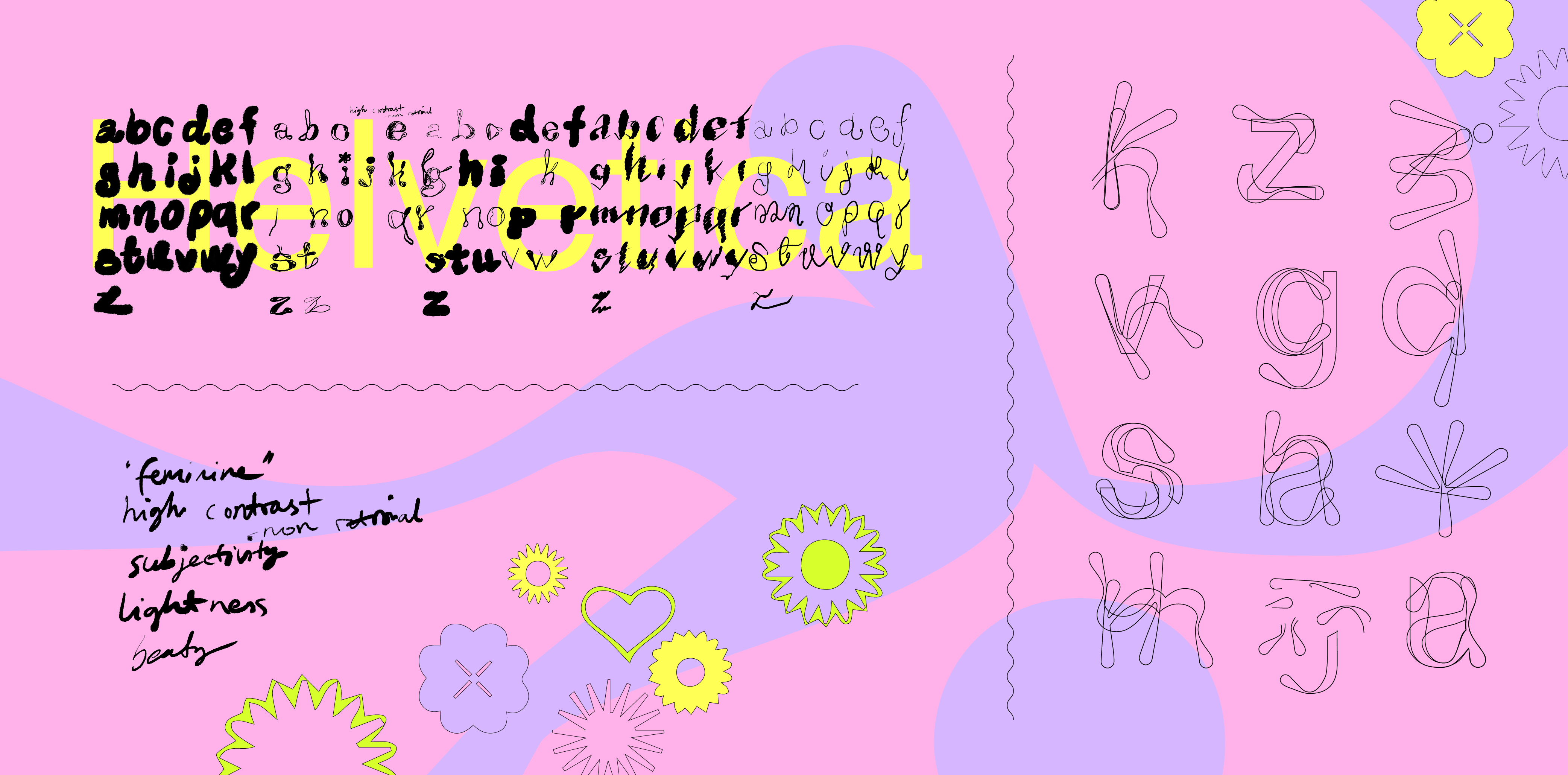
Drip is the outcome of a design process that focused on questioning neutrality in typography. I wanted to explore why some typefaces are perceived as “normal” and invisible, whereas others immediately catch our attention and thus seem unsuitable for everyday visual communication. Because graphic design happens in contact with the society that surrounds it, it is worthwhile to explore where typographic conventions come from and how today’s typographic preferences echo dated social power structures. I was particularly interested in uncovering features that have been left outside the definition of neutrality. Consequently my typeface represents an alternative reality, where traditionally maligned features have become desired ones. The project has been approached from a feminist viewpoint. Thus, my design process regarding Drip was particularly focused on investigating how the tradition of typography has overlooked female experience.
My research discovered how in relation to type design, certain visual characteristics have been consciously endorsed while others have come across opposition. Even though the idea of “neutral” typography has aimed to promote universalism, it has been created from a specific point of view that has often been male. Furthermore, “feminine” has acted as an umbrella term, under which undesirable visual qualities such as ornamentation, lightness and beauty have been organised. Simply recognising the male-centric nature of typographic traditions illustrates how biased our ideas regarding “normal” typefaces can be.
Drip is based on Helvetica. As I was interested in challenging the idea of neutral typography, I explored the typeface from the viewpoint of the maligned qualities I had discovered during my research. Consequently, Drip became the alternative version of “normal”, where conventionally praised features have become meaningless and disapproved qualities celebrated instead. Drip goes against Helvetica’s perceived clarity, objectivity and simplicity and focuses on expression, subjectivity and complexity instead. Letters that were previously geometric columns have evolved into high contrast, organic and wonky forms. The outcome was achieved through an instinctive way of working which disregarded exact measuring. Instead, letters were constructed through cutting and pasting various shapes together in an intuitive manner.